
Tips For Building A Mobile Friendly Website
Developing a mobile-friendly website can be challenging, but it is essential in today’s market. Here are some tips for ensuring your site is optimized for mobile devices. Keep your design simple, use large font sizes and buttons, and make sure your content is easy to read on smaller screens. These are just a few things to keep in mind when creating a mobile friendly website. With these tips, you’ll be well on your way to success!
Top reasons why you need a mobile friendly website
- Reach a Wider Audience: Mobile-friendly websites allow you to reach potential customers who may have otherwise been unavailable. By having a mobile-friendly website, you can ensure that users can access your content regardless of whether they are using a laptop, tablet, or smartphone. This gives you the chance to tap into an entirely different market segment and expand your customer base considerably.
- Improve User Experience: A mobile-friendly website is designed for easy navigation on small screens so users can easily find the information they are looking for without having to zoom in and out repeatedly. It also helps ensure that nobody has difficulty viewing or reading your content, improving their overall user experience with your website.

- Increase Search Engine Rankings: Mobile friendly websites are favored by search engines such as Google, so having one will help boost your website’s ranking in the search engine results pages (SERPs). This helps you get more organic traffic and visibility, leading to more conversions.
- Stay Ahead of The Curve: As mobile usage continues to grow, it is becoming increasingly important for businesses to have a mobile-friendly website that looks great on all devices if they want to stay ahead of their competition. A mobile-friendly website ensures you don’t miss out on potential customers trying to access your content from their smartphones or other small screen devices.
- Optimize for All Screen Sizes: Different devices have different screen sizes, so having a mobile-friendly website helps ensure your content looks great on all devices. This ensures that no matter what size device your customers are using to access your website, they can get the full experience and find the information they need easily and quickly.
By having a mobile-friendly website, you can ensure that users have an optimal viewing experience, improve your search engine rankings, and reach more potential customers. A mobile-friendly website is becoming increasingly important today, so make sure you stay ahead of the curve by building one today!
How to make your website mobile friendly in easy steps
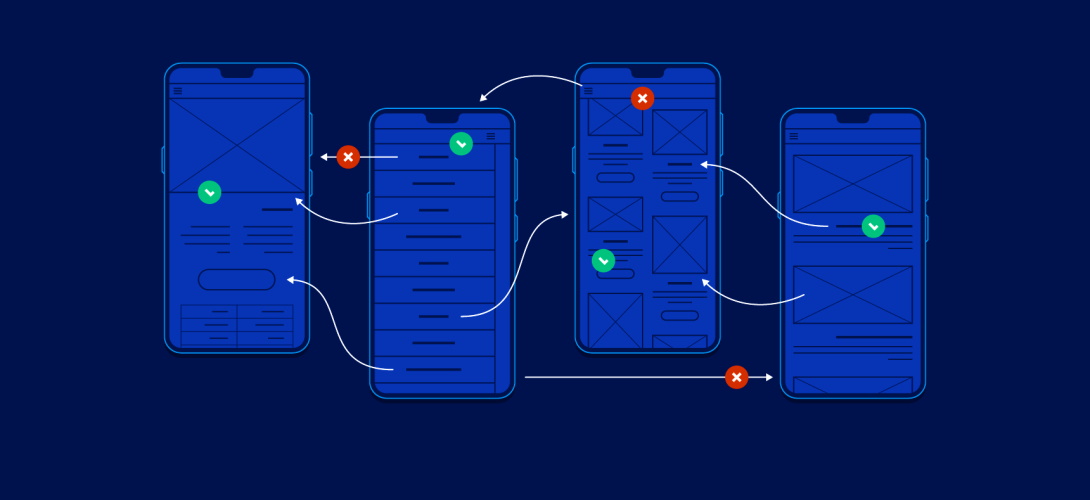
- Use Responsive Web Design: The use of responsive web design (RWD) is a must for any website today. It ensures that your website looks great on all devices, from PCs to tablets and smartphones. With RWD, you don’t have to create a separate mobile version of your website; the same content and layout will be displayed perfectly on any device.
- Optimize Your Images: Make sure your images are optimized for different display sizes. Make sure they’re compressed properly so they can load quickly, and also make sure they’re cropped and sized appropriately for different screen sizes.
- Ensure Crawlability: Many search engines now look at how well a website is optimized for mobile devices when ranking the content. To improve your chances of appearing in search engine rankings, make sure that crawlers can easily access your website from a mobile device.
- Use Larger Fonts: Mobile phones have relatively small screens, so you need to ensure that visitors can read your content without having to zoom in. Make sure to use larger fonts and keep paragraphs short and concise.
- Reduce Your Content: It’s important to reduce the content on each page so it will load on a mobile phone connection. Consider using collapsible menus and drop-down boxes instead of full-length pages with lots of text or images.
- Test For Usability: Finally, you must ensure that your website is easy to navigate on a mobile device. Test out various features, such as menus and forms, and see how well they work on different browsers and devices. Make sure to address any issues you find before launching your website.
By following these steps, you can create a mobile-friendly version of your website in no time!